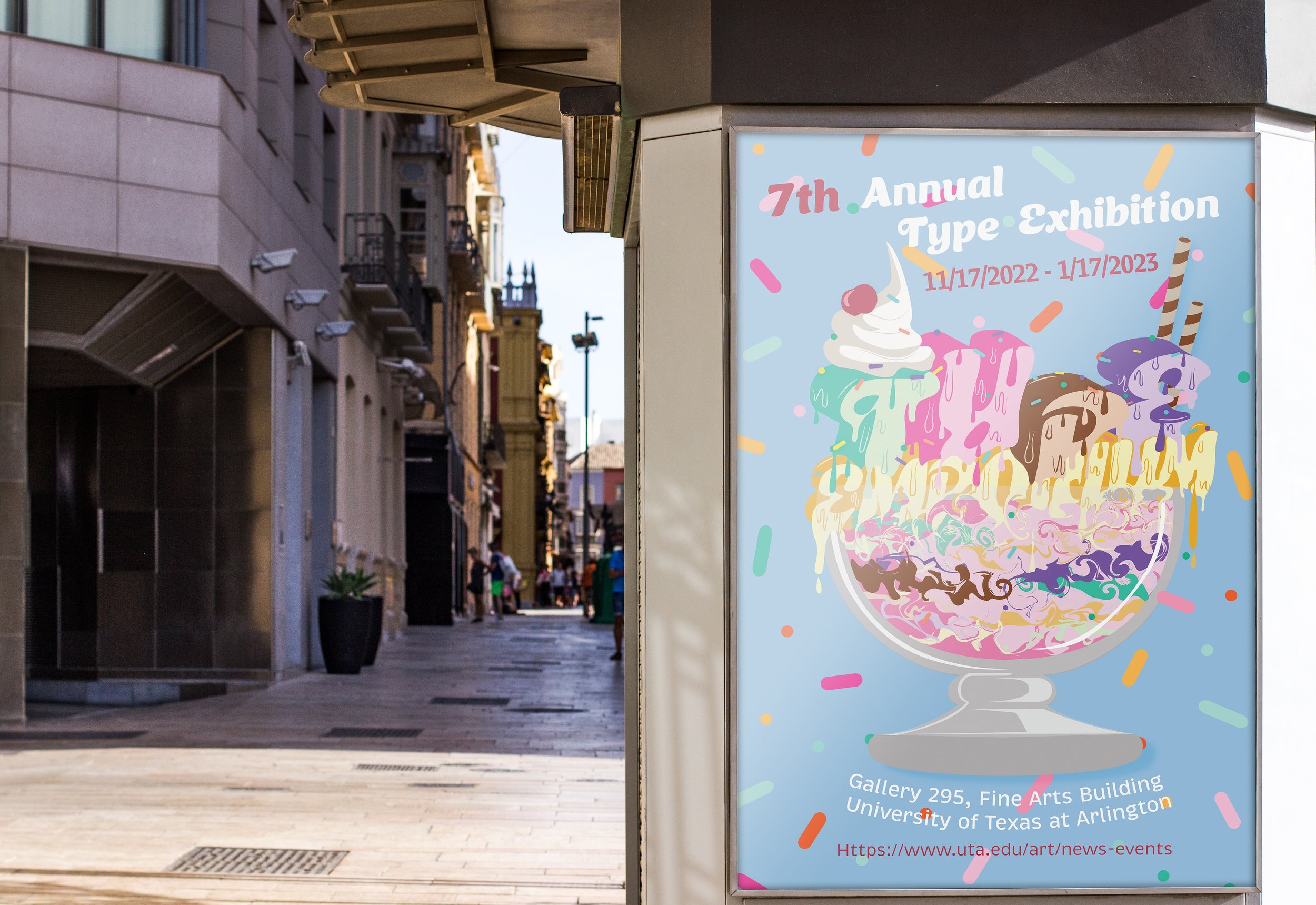
Type Emporium combines typography and illustration to create a branding concept for a Typography Exhibition, infusing playful experimentation with type and vibrant colors to evoke a delightful ice cream aesthetic that irresistibly draws in viewers like a sundae!
Elements reminiscent of a sundae, such as sprinkles, whipped cream, wafer sticks, and a cherry, interact with the text, creating a unique and lively atmosphere. Inspired by classic ice cream flavors and toppings the brand’s color palette exudes brightness and happiness. Isometric-type techniques add depth and dimension, enhancing the visual impact and creating a dynamic viewing experience.


